
After many years of fantastic sales, Sarah Dessen's books are finally getting a new look! A lot of people are not exactly huge fans of the signature faceless girl on Dessen's covers.... so they changed them! In favor of a cover where the the author's name takes up half the cover. *face palm* (that's kind of a pet peeve of mine...)
Since I am a huge Dessen fan, I just had to compile them and give my thoughts in a cover battle of new vs. old...

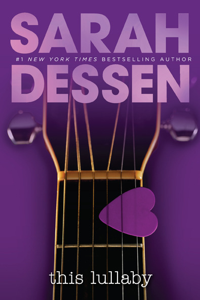
I like the old one. For sure. Nothing against the new cover or anything--I adore the purples! But... at the same time, I just think the new cover is a little too... cutesy? Cheesy? Dang, I cannot think of the right word at the moment... I think the heart-shaped pick and and guitar are great with regards to the story, but the combination on the cover just looks really commercial-y. Maybe the guitar just looks too fake.
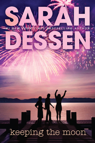

Hands down, I LOVE the new cover. The colors, the fireworks, the setting, the silhouettes, I love it all! It doesn't even faze me that "Sarah Dessen" covers nearly half of the cover! Yeah. That's real cover love right there.
~ahhhh I can't stop looking at it! >w<
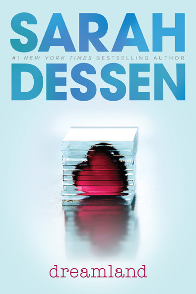

Hrmm... darn. This one's hard. While I think the dark blues of the old cover set a better vibe for the story-line of Dreamland, my own personal tastes like the new cover a teensy bit more. It's artsy and a tad whimsical.
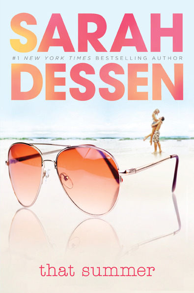

Oooh. Another hard one. I like the handstand on the old cover... but I think the colors of the new one are better. Especially for summer. The old one looks a little too faded and doesn't have that spark that's associated with the excitement of summer.


Easy peasy. The original cover is probably my all-time favorite Dessen cover and the new one just can't match up--at least, not in my head. Although, the shopoholic in me would definitely buy that bracelet if it was ever marketed. However, I just really really like the whole faceless-girl-plucking-the-pretty-flower-petals thing that the old cover has going on. I personally don't mind the whole faceless girl thing.


Again: the faceless girl doesn't really bother me.... wait, but in this case they're both faceless...Meh. I still like the first one better. The new one, while pretty and pink, which I like, strikes me as a little too commercial-y and fluffy, which, if you've read Just Listen, you know it is anything but a light, fluffy read.


THANK YOU publishers/designers/whoever-decided-to-redo-the-covers for finally giving this one a makeover! Of all the original Sarah Dessen covers, this one would probably be my least favorite. And thankyouthankyouthankyou for making the new one super pretty! I just LOVE it! It's artsy and still retains that signature Sarah Dessen vibe!


Ohhhhh.... can this one please be a tie??? I honestly can't really decide! I like both of them! I love the idea of the butterflies escaping the jars--but at the same time, there is this unbreakable internal connection between Someone Like You and the old cover. I just can't separate them!
Yup. I'm forced to announce a tie in this case.


*starts thinking I maybe should have save the tie for this one*
Hommina hommina hommina...
Okay. I think the new cover wins--mainly because the background actually looks like it's a real beach. The old one, while I loved the presence of the guy (Eli), looked plastic-y and fake-ish. And although I can't really see the girl in the new cover as being Auden (she looks a little too beach-chick...) I will let that go.

No comments:
Post a Comment
Thanks so much for commenting! I read every single one and they always make my day! <3
*Sorry, this is now an awards-free blog as I've already been nominated for them. Thanks for your consideration!